How Do Aspect Ratios Affect Game UI on Phones?
In the fast-evolving world of mobile gaming, delivering a seamless and enjoyable user experience is paramount. One key factor that developers and designers often grapple with is how aspect ratio influences mobile game UI. Unlike desktop or console gaming, mobile games must gracefully adapt to a diverse array of screen sizes and shapes, all while keeping gameplay intuitive and engaging.
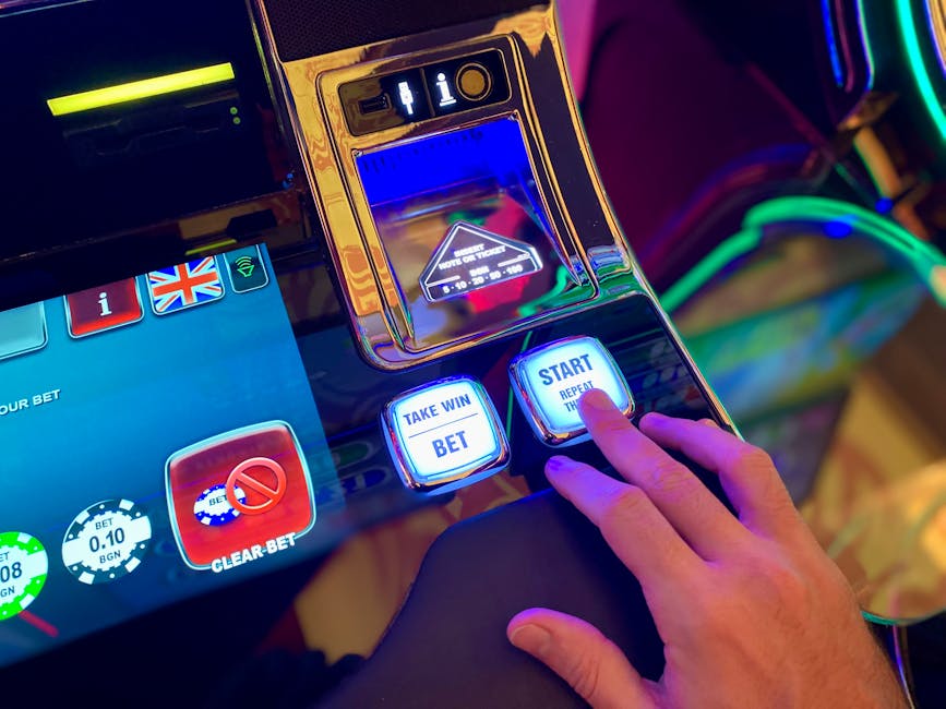
Companies like MrQ, Red Tiger, and industry leaders leveraging Google web.dev best practices are pushing the boundaries of responsive game design using technologies like HTML5 in mobile browsers. Understanding how aspect ratios impact your UI is crucial for delivering touch-first, user-centered experiences that accommodate variable device dimensions.
What Is Aspect Ratio and Why Does It Matter for Mobile Game UI?
Aspect ratio defines the proportional relationship between the width and height of a screen. For example, a 16:9 aspect ratio means the screen width is 16 units for every 9 units of height. Phones today vary widely — from older 16:9 devices to tall, narrow 19.5:9 or 20:9 displays, and even unusual squareish or foldable screens.
This variability directly affects how your game’s user interface should be rendered and positioned. Unlike fixed screen sizes of consoles, phone aspect ratios can dramatically change the amount of horizontal and vertical space available without resizing the physical screen.
Why Game UI Must Respect Aspect Ratios
- Visibility and Layout Integrity: UI elements must remain fully visible and not cropped off-screen due to narrower or taller aspect ratios.
- Ergonomic Thumb Reach: Elements that require frequent interaction should be reachable with minimal thumb travel—affected by screen height and shape.
- Consistent Gameplay Area: Avoid distorting gameplay regions or placing key interactive controls in unreachable edges.
Failing to adapt UI can lead to frustrating experiences, from tiny buttons that are hard to tap to overcrowded controls crammed into small areas. This is why developers like Red Tiger invest heavily in testing across different device ratios, ensuring optimal player comfort.
Small-Screen UI Prioritization: What Needs to Stay Visible and Accessible
Smaller screens inherently demand careful prioritization of on-screen elements. Especially in fast-paced games delivered through mobile browsers using HTML5, clutter can kill engagement. Consider the following UI categories and their prioritization:
UI Element Should It Stay Visible Constantly? Can It Be Hidden Behind Menus? Touch Considerations Core Controls (e.g., movement, attack buttons) Yes - must always stay visible No Large, well-spaced buttons to avoid misses Score / Game Status Generally yes, but minimal footprint Rarely Placed in corners, not obstructing game area Settings & Help No Yes - behind menus or overlays Tappable icons sized for thumb use Ads or Promotions No Yes - should never interfere with core controls Optional dismiss buttons reachable at thumb tipsMrQ, who operate extensively on mobile platforms, emphasize touch-first sizedesk ergonomics by positioning frequently used controls within easy thumb zones—usually the bottom right or left corners for most users. Ensuring that even on tall aspect ratios these buttons don’t require awkward stretches is key.
Thumb Reach and Touch-First Ergonomics for Varied Aspect Ratios
One common mistake is placing interactive elements solely according to fixed breakpoints, ignoring the user's natural hand position and thumb reach. Especially on taller phones where the screen extends beyond natural thumb length, users may struggle with top-edge buttons.
Key Thumb Reach Zones
- Easy Reach Zone: Lower half of the screen, especially near bottom corners
- Difficult Reach Zone: Top edges and far upper corners
Responsive layouts must redefine UI placement dynamically to keep high-touch elements within the easy reach zone, regardless of whether a device is a 16:9 or 20:9 aspect ratio.
Google web.dev recommends considering thumb-friendly tap sizes — ideally at least 48x48 pixels on mobile screens — and adequate spacing to avoid mis-taps. This applies equally to mobile games accessed in browsers, where space is limited and finger precision critical.
Responsive Layouts vs. Fixed Breakpoints
Traditional responsive designs often rely on fixed breakpoints — e.g., under 600px width, apply mobile styles. But these fixed widths ignore the major role that aspect ratio plays in arranging UI components. A phone with a 720px width might be significantly taller if its aspect ratio is 20:9 versus 16:9.
Why Responsive Layouts Are Better for Mobile Game UI
- Dynamic UI Adjustment: UI elements can reposition or resize fluidly based on actual viewport shape, not just width.
- Game Area Scaling: Maintain designed gameplay regions without forced clipping or distortion.
- Adaptive Padding & Margins: Prevent UI from appearing cramped or leaving excessive empty spaces.
Red Tiger is a prime example of a company excelling at implementing truly responsive layouts for mobile game UIs. Using HTML5 canvas and CSS techniques, their interfaces adapt fluidly to device differences while maintaining visual balance and usability.
Variable Device Sizes and Aspect Ratios: Challenges and Solutions
The modern Android market alone spans thousands of devices with screen sizes from compact 4-inch displays to giant phablets, not to mention foldables introducing new aspect ratios on the fly. iPhones too have evolved: older 16:9 devices give way to iPhone X and beyond with the 19.5:9 notch-shaped displays.
These challenges affect both content presentation and user interaction:
- UI Scaling: Fixed-size controls may become tiny or oversized. Developers should use relative units (%, vw, vh) and scalable vector graphics.
- Orientation Changes: UI must seamlessly adapt between portrait and landscape without losing control accessibility.
- Safe Areas: Consider device-specific notches or rounded corners to avoid accidental occlusion.
Leveraging tools and guidance from Google web.dev for responsive design alongside real-device testing is essential. MrQ’s mobile game teams test across multiple browsers (e.g., iOS Safari, Android Chrome) ensuring their HTML5 games look and operate flawlessly regardless of device shape.
Practical Tips for Designing Mobile Game UI Around Aspect Ratios
- Use Flexible Grid Systems: Implement grid-based layouts that adjust columns and rows dynamically.
- Prioritize Core Controls in Thumb Zones: Always position essential buttons within the easy reach area of the dominant hand.
- Employ Scalable Vector Elements: Use SVGs and CSS to maintain crisp UI across resolutions and sizes.
- Hide Secondary Features in Menus: Settings, help, and promos can be tucked behind hamburger or overlay menus to declutter screens.
- Test on Real Devices & Emulators: Check UI behavior on varying aspect ratios to spot misalignments or off-screen content.
- Design for Both Orientations: Make sure UI changes gracefully when users rotate their devices.
- Respect Safe Areas: Account for notches and curved edges particularly on newer smartphones.
Conclusion: Aspect Ratio Awareness Is Essential for Mobile Game UI Success
Aspect ratio is more than just a number; it fundamentally influences how mobile game UI must be crafted. Recognizing the diversity in device shapes and sizes, implementing responsive layouts over fixed breakpoints, and focusing on touch-first ergonomics help deliver user experiences that feel natural, comfortable, and immersive.

By following proven guidance—such as that from Google web.dev—and learning from forward-thinking companies like MrQ and Red Tiger, designers can master the intricate art of balancing gameplay, UI visibility, and thumb reach. Harnessing HTML5 and mobile browser capabilities unlocks smooth, responsive game interfaces that work beautifully on any screen.
Whether you’re designing straightforward buttons or complex HUDs, never overlook how aspect ratio shapes the player's interaction with your game. Get it right, and your users will thank you with longer sessions and higher engagement.